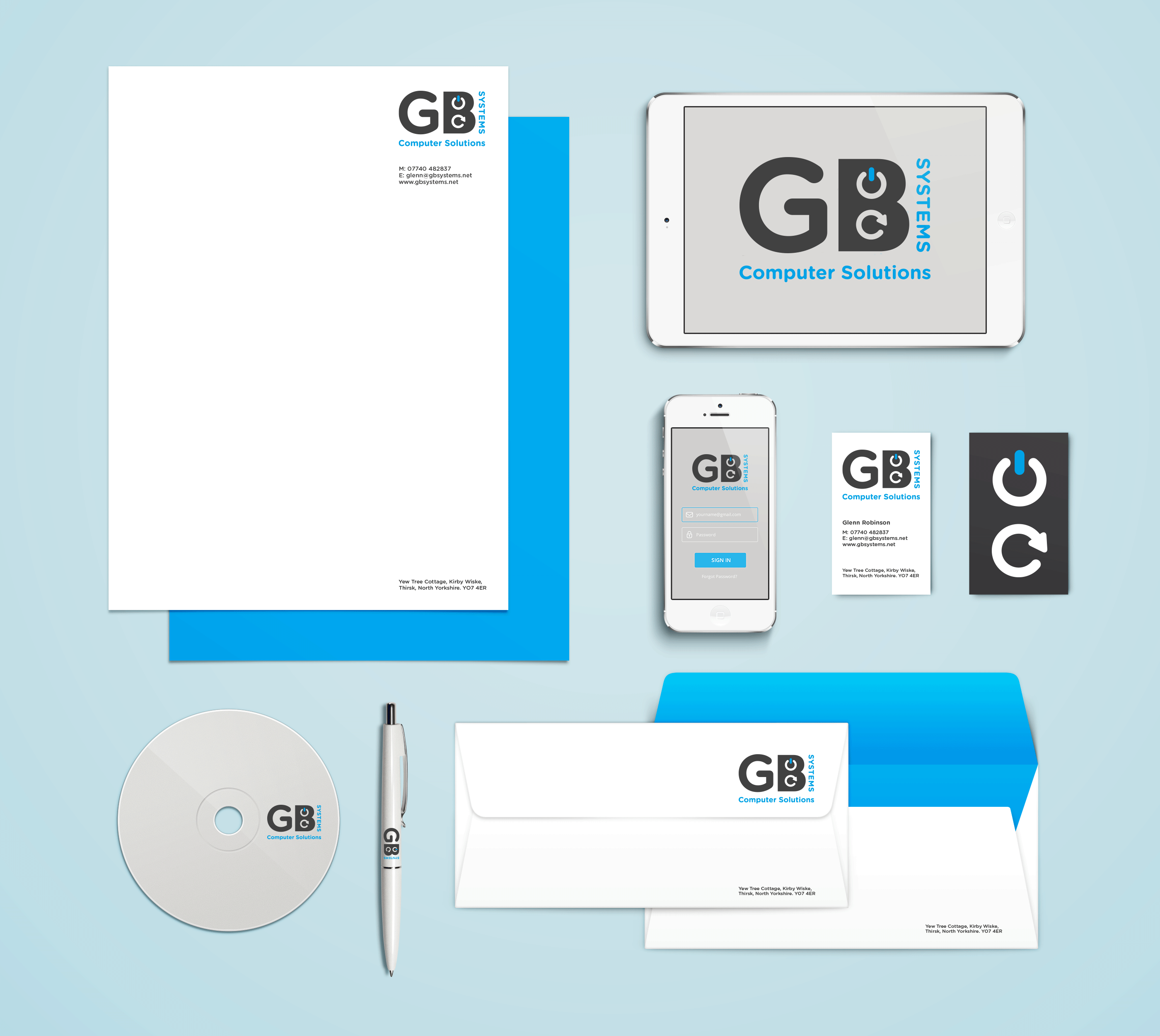
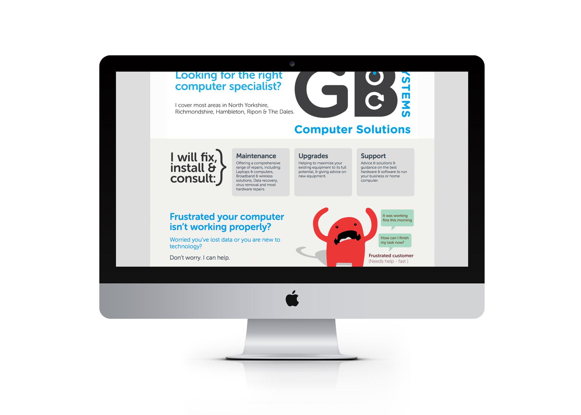
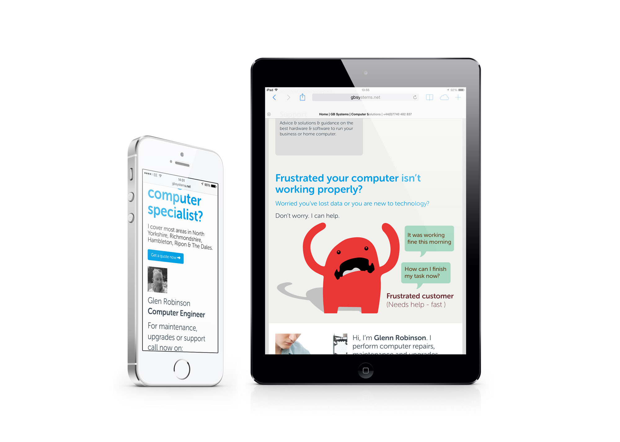
Identity creation and website design for a Yorkshire based computer consultant. By using the universal ‘power’ and ‘refresh’ symbols to form the inner shape of the letter ‘B’. The new logo cleverly communicates a hidden message about the companys’ services.
GB Systems
RH BUILD
Disciplines:
- – Identity creation
- – Illustration
- – Artwork production